Creating accessible Grist documents
Warning
Nous commençons tout juste à traduire la documentation pour cette langue, désolé !
Nous affichons des pages traduites partiellement afin de suivre l’avancement.
Cette page n’est pas encore traduite. Mais la bonne nouvelle est que vous pouvez rejoindre la communauté de traduction pour nous aider 👋.
This page is about how to author accessible Grist documents. If you are interested in how to use Grist if you have disabilities, see the Accessibility: using Grist page.
What are accessible documents?#
A good practice to keep in mind when authoring content online is to make sure everyone can perceive and understand it, whatever their disabilities.
For example, that means considering deaf people and writing a text transcription or subtitles when making a video. Or considering blind people and providing text descriptions of your images that can be read by speech synthesis tools.
That is what we mean when we talk about accessibility.
In Grist, there are a few considerations we can make to create accessible documents.
Colors#
You can apply any color you want to column headers and cells, specifying both background and text color.
Here are examples of how colors can be perceived by people with different color blindnesses or low contrast sensitivity:
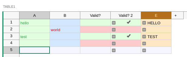
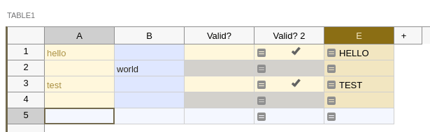
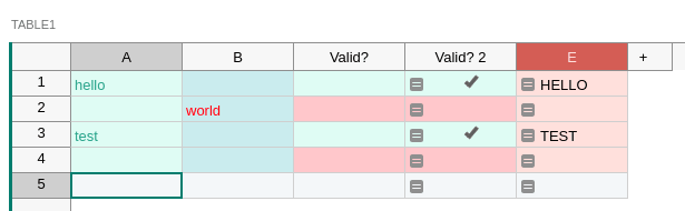
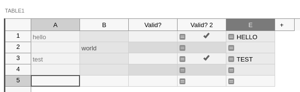
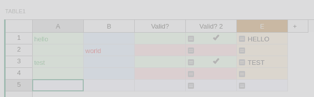
With these examples, we realize that:
- High contrast between colors is important. In multiple pictures, the first column content is hard or very hard to read. When in doubt, use a color contrast checker.
- Avoid using color alone to convey information. The third column, which has only green or red cells to show if the line is “valid”, is not enough. In multiple pictures, we cannot understand whether the color means “valid” or “invalid”. The fourth column adds a check icon in the cell in addition to the color, making it accessible: even if I can’t perceive the color, I can see the checkmark.
Tip
When specifying column header colors or cell colors, we advise on always choosing a pair of background + text color, and not only a background color or only a text color. This makes sure your choices are always applied, whatever the theme people use to read your document (light theme, dark theme or high contrast theme).
Images#
As soon as you insert images in your content, you should think of the blind and those with low vision. If I’m blind, I use an additional tool to understand content, like a screen reader: it vocalizes, with speech synthesis, the content of the page. Tools like that can read text without issue, but can’t guess what your images mean.
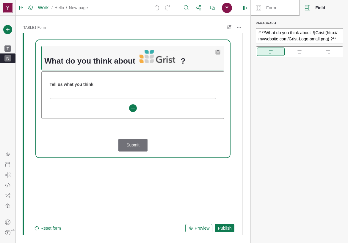
In Grist, you can include images thanks to Markdown support in forms or text cells. Be sure to use the  syntax. The “alt text” is what screen readers read aloud for people to understand the image.
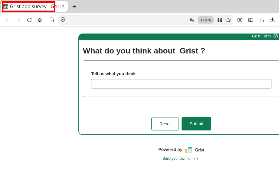
To choose a good alt text, try to remove the image: what visible text would you write instead? In the example below, “Grist” is the correct alt to use. Not “Blue, yellow and gray logo with Grist next to it”, not “Grist logo”. It’s “Grist”, because without the image, you would say “What do you think about Grist?”.
Forms#
Page title#
When publishing a form, watch out for the form page title. You can edit it by changing the “widget title” in the form configuration:
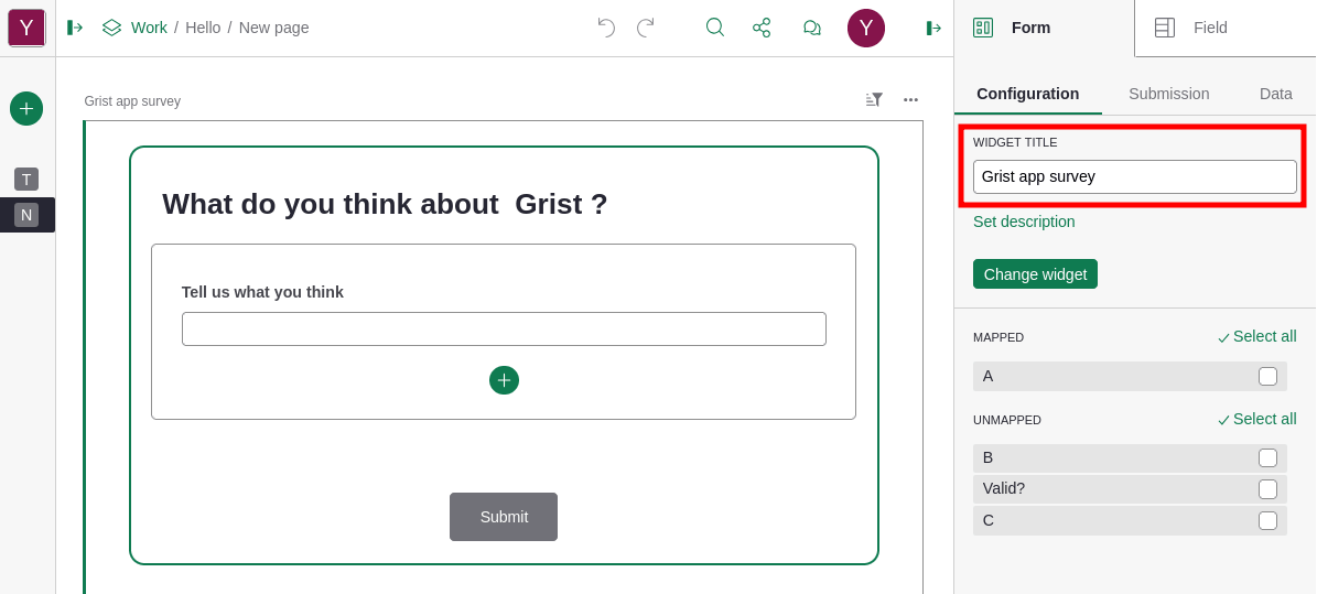
This title is used as the form page title in the browser. This title is very important for people using assistive technologies like screen readers to understand which page they are on.